I worked on Ford Motors for 2+ years. I have divided this project in two parts. FordPass App and Team Edison.
FordPass App
I started working on Ford Motors as part of a WPP global design team as a senior designer. I was exclusively working on FordPass app. Initially it was BAU work. This included partnerships with brands like Hertz, ongoing dev support & designing solutions for new business requirements and features like parking.
Six months into the project the app reached a place where it made sense for business to go back to square one and start the re-design process. This took place over 8 months as part of global design sprints divided in 3 regional teams, North America, Europe, Asia. I was working as the lead designer in EU.
Design process
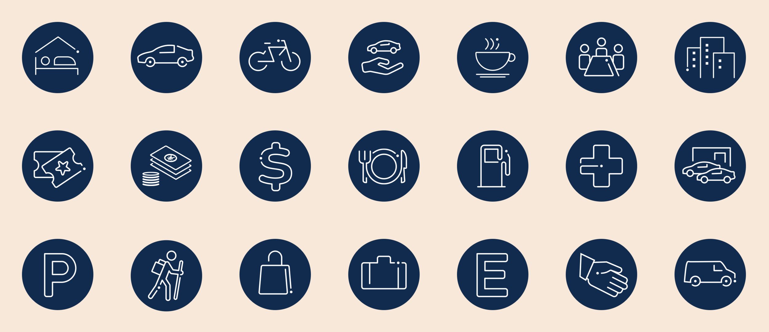
The first couple of sprints consisted of nailing the design language and guidelines. The key idea was to keep the look as ‘light’ as possible by using as much system architecture as possible. For example, we moved away from using full suit of Ford fonts to just one for headlines and native fonts for everything else.
The biggest advantage design team had was involvement of development team from day one. Working closely with developers on and off-site really helped to understand the constraints of each platform (Android and iOS).
Business objectives
Improve app rating
Make the app smaller in size to download
Have one framework for two apps; FordPass and Lincoln Way
At least AA level accessibility compliance; as the previous app failed this on several screens 😔
New features; ground up design for new brand positioning of the app; “Journeys made easier”
One place for all things related to Ford ownership especially support
User testing was integral part of design sprints with every 3rd sprint for testing. We tested on interactive prototypes on site and off site using Lookback. The feedback made its way to design in the next sprint. This was a priceless addition. As designers we tend to get too ‘screen focussed’ and forget about touch points outside the app and the difference an interaction or animation can make. The constant thin line to walk on was achieve good user feedback and keep it ‘on brand’.
Stakeholder management was a big part of this project given the size of Ford as organisation. Each sprint contained two showcases, one with product owners and other with senior stakeholders. The outcomes of those plus user testing fed back into next sprint.
The app currently has ⭐⭐⭐⭐ 4.6, with 60.7K ratings on App Store and ⭐⭐⭐ 3.5 with 6.9K ratings on Google Play.
Hertz 24/7 Van reservation through the FordPass App
Team Edison
Ford built Team Edison to focus exclusively on electrified vehicles for both Ford and Lincoln. In their own words; This is a dedicated team who has been lucky enough to be chosen to pilot the future of Ford. It’s the shift in mindset that is truly creating change at Ford, and giving license to the team to operate in a completely different way.
I became part of the EU counterpart of Team Edison a year or so ago in late 2017 as a lead designer. I was working on the European launch of their Electric Vehicle (EV). This is launch market. The first six months of the project consisted of requirement gathering and market analysis. This included working on-site with product owners and stakeholders in the Ford Cologne factory as well as Ford’s development team in Essex.
Ford wants to move towards the ‘direct sell’ model. This introduced a challenge to have real time inventory as part of the whole experience. This also meant that the car configurator needed to be much more e-commerce. The current industry standard is where the user configures a vehicle and that generates a dealer query.
The key deliverables for the vehicle reveal were a ‘coming soon’ (register interest) page, a product page and a configurator.
Card sorting results
The initial part of the project involved aligning on business requirement and then presenting them to the user. We did card sorting exercises with real users to prioritise their needs. Once these were defined we started the initial wireframing. Due to stakeholder involvement it was tricky to get the fidelity just right. The next couple of months were spent on refining the wireframes internally and with Ford product owners. We took these wireframes to user testing.
User research outcomes and wireframes
Competitive analysis
User research quotes
Higher fidelity wireframes
UI Design
The UI design happened in parallel with user research and experience design. This is Ford’s vision of the future so everything was designed component based and modular for ultimate flexibility. This is the same UI that will be used in the HMI in the vehicle. The focus was on clarity, contrast and making the interface feel tangible & real. The term coined for this was ‘skeuomor-flat’ 😜
I left Ford/WPP before the launch of the vehicle in March 2019.


